Designing worn out Betamax Covers
Mistakes were made
Not that long ago I published my first short story, and the editors asked me for my website to put on the author blurb. With only one story credit to my name, I hadn’t thought of making an entire website. Deciding to screw over my future self, I registered a domain name and sent that to the editors, figuring I’d have plenty of time to make the site before the book went to print.
As the launch approached, I realized I had to throw something together and started thinking about what I wanted my site to look like. Around that time, I became aware of outfits like Witter Entertainment which were selling contemporary horror movies on VHS (e.g., Mandy, The Void, The V/H/S/ series). I thought the garish aesthetic of 80s Horror VHS would make for amazing story art for some of the stories I then had in mind and so I ran with it. In retrospect, what a daft idea, as I was now committing myself to making a custom VHS (actually Betamax) cover art for each and every future story…
And so, I went to work creating a few Beta covers. One for the story I published (A Dark Quadrivium) and another four for stories I was planning to write so that I had a bit of content to populate the page with. After all, a website with one story would have been a sad sight.
There was no Plan
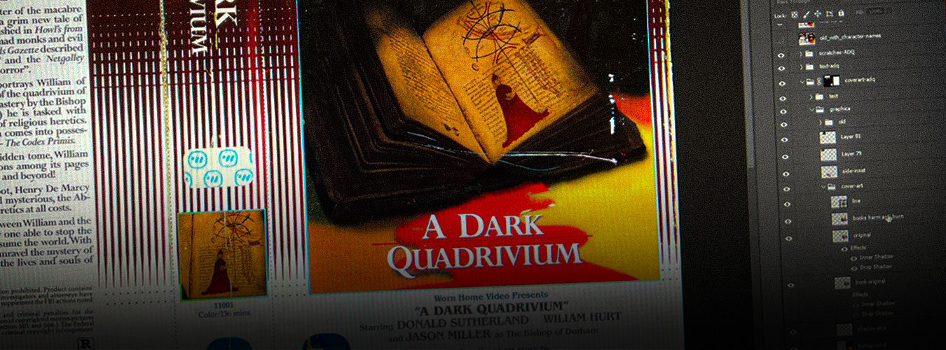
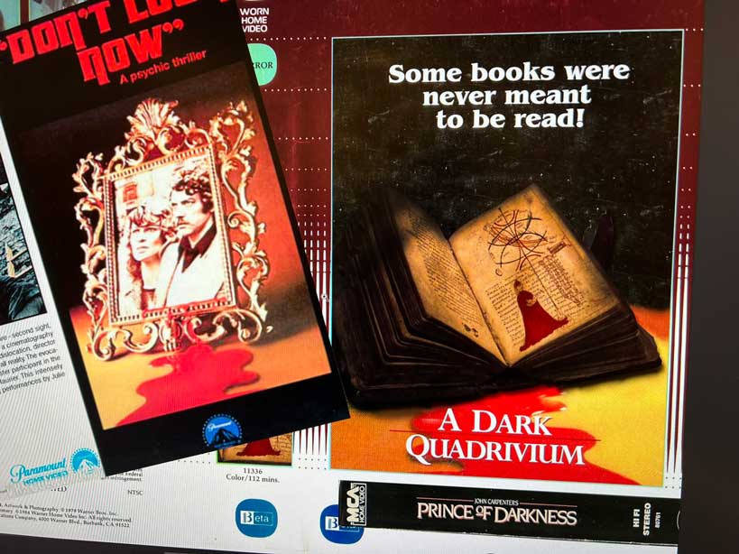
There was no real vision for the story art. I mostly mucked about looking at images of old VHS artwork and tried to find a layout or design that I thought could fit the story. The first one I did was for A Dark Quadrivium and the inspiration for that one should be pretty obvious to anyone who’s ever seen the poster for Don’t Look Now. It had been a while since I’d dabbled in graphic design, so the first few were just me trying to relearn some skills after like a hundred Adobe suite upgrades since the last time I’d worked in Photoshop and Illustrator.
For this one, I grabbed a public-domain photo of an old bible and overlayed an image I’d found while doing research for the story. The image is of this rather odd-looking bishop in blood-red robes holding an armillary sphere that I ended up describing in the story itself. The rest was just basic photo manipulation to get the effect I wanted. The type design I borrowed from John Carpenter’s Prince of Darkness (a big influence on the story).
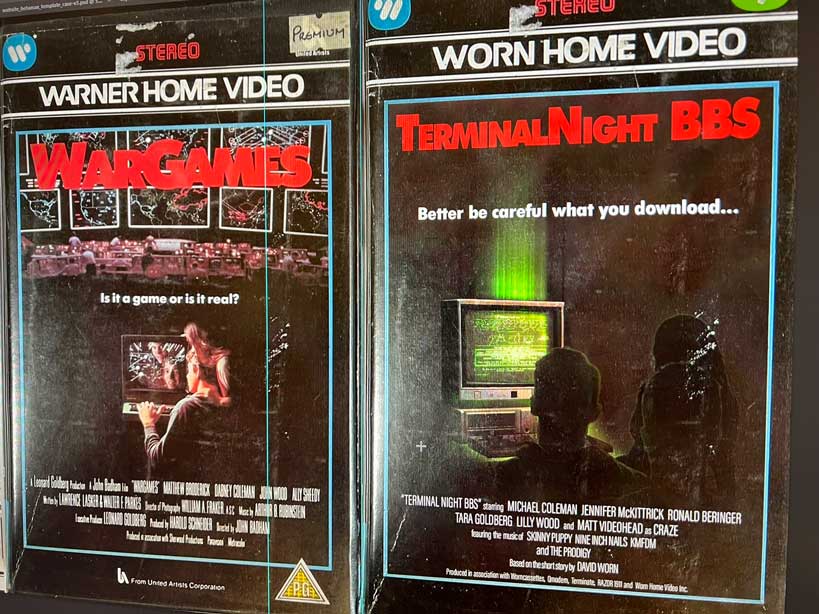
Other covers proceeded similarly, taking inspiration from old VHS artwork and applying them to the story. Here’s one based on Wargames that was done for a BBS-related story. (that I still haven’t finished!) This one is built up from a photo of a vintage computer, some vector art of silhouettes, and some ASCII art of the fictional website that I made. The dirt, scratches and imperfections really help to sell it.
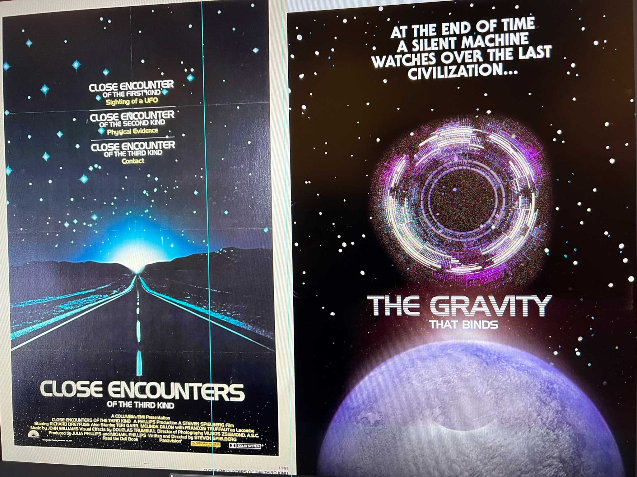
For the cover art of a Sci-Fi story, I was working on, I took inspiration from the poster art for Close Encounters of the Third Kind. In the process I discovered that the internet is full of people trying to identify fonts used in movie poster typography. More rabbit holes were explored than I care to admit reading up on this stuff.
Dirt and highlights.
Once the videocassette sleeves were made, I copied them over in three pieces (front, back, side) to a pair of Photoshop file that automat the perspective warp necessary to get the 3D box effect. From there, I overlayed them over a photo of a videotape clamshell and added a few layers of “highlights” to duplicate the imperfect plastic of an old tape. The highlights were made by scanning the boxes of a few old Warner Bros. tapes I bought off eBay. For the longest time, I thought I’d never use my scanner again, but working on this project demonstrated how useful it can be to make elements like dirt, scratches, and plastic highlights that I could then use to make these tapes look old and worn.
Midjourney and DALL-E enter the scene.
After a few months, I had another slate of stories published or accepted and it was time to make a few more videocassette covers. By that time DALL-E and Midjourney became popular, and, like the rest of the Internet, I got swept up in the initial enthusiasm during those first few weeks. As I was designing covers for my new stories (Lullaby, Don’t Play in the Closet, The Baby Monitor) I played around with Midjourney to see if it could generate some of the elements I needed.
Bye Bye Generative A.I.
Over time, as more details about Midjourney and DALL-E came out and the ethics became more obvious, I soured on the idea of using generative AI. Sure, they might look better than my janky handmade earlier covers but, ethics aside, they also sucked the fun out of it. After all, this was a passion project. Why was I taking shortcuts?
And so, I busted out Photoshop and went to work undoing what I had done, making new art the old-fashioned way.
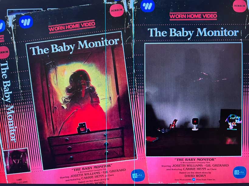
The first cover I tackled was The Baby Monitor as that was the easiest fix since. I snapped a photo of my daughter’s baby monitor, touched it up to make it spookier, added a hint of a woman’s shadow on the wall, and called it a day.
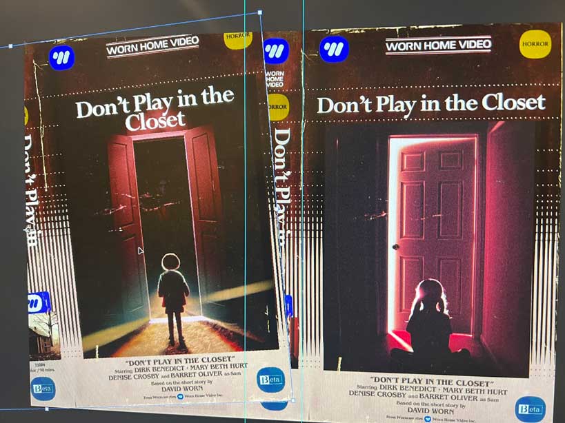
Note: For these next images the old A.I. art is on the left and the new Human-made art is on the right.
After that, I worked on Lullaby. For this one, I decided to take a different tack and started with stock art of a pill and wrapped some typography around it (a reference to the 5-RED pills used in the story). I didn’t do the greatest job (one of the edges of the pill was rough) so I covered it up with a scan of a scratch…these are old boxes after all!
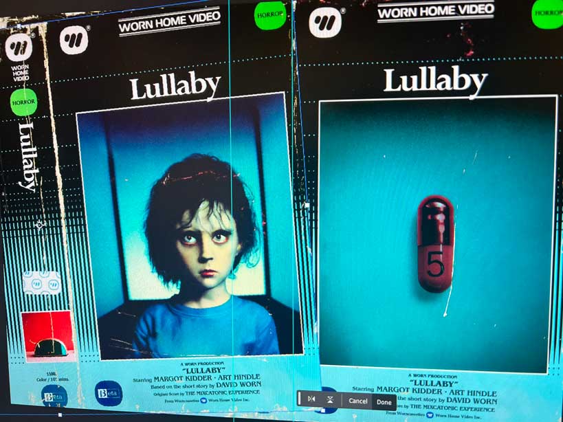
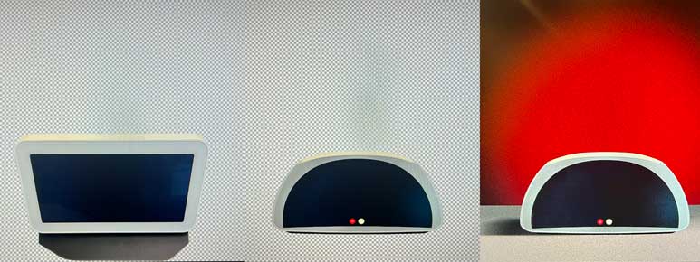
For the “movie still” image on the back of the videocassette sleeve, I created a new pill dispensing machine by warping a photo I took of an Amazon Echo Show and used gradients and noise to create a floor and wall. The shadows and reflections were painted in using different blending modes.
Finally, the only remaining bit of A.I. art left to undo was on the box for Don’t Play in the Closet. For that one, I used a mix of photos, stock art (e.g., the silhouette of the child), and a lot of color and lighting tweaks. The “movie still” image on the back is heavily edited stock art of a playhouse composited into two photos of trees I took on a rainy day while walking into work.
All covers now 100% Human Made!
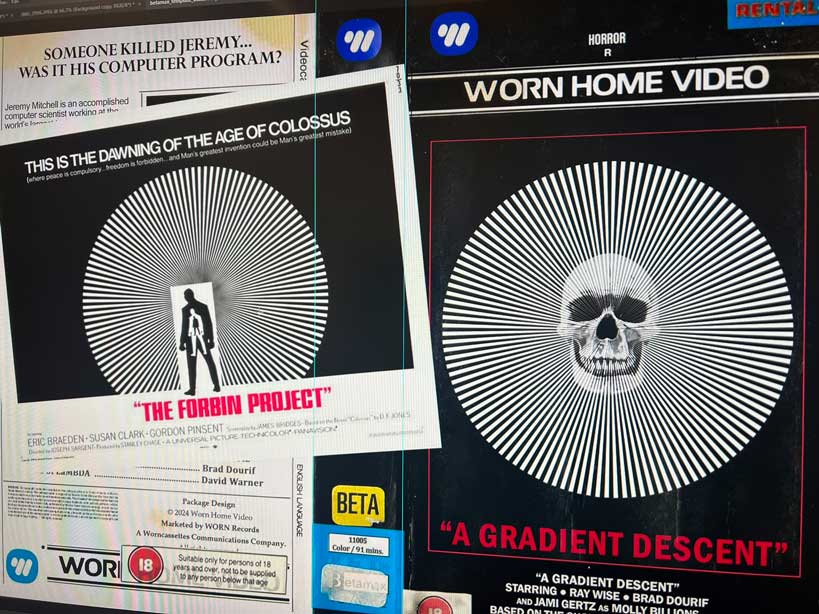
After getting rid of the A.I. generated elements, I had two new publications to add to the site: The Vela Remnant and A Gradient Descent. Nothing special for these, The Vela Remnant was made from a few public domain NASA photos with some layering of stock art of a skull. The “movie still” image on the back is a warped photo of a theater mask and another of a circular aquarium viewport. I’m not pleased with it, but it serves its purpose…
The cover art for A Gradient Descent was based on the movie Collosus: The Forbin Project which was an influence on the story. This one used the same stock art skull I used in The Vela Remnant and Lux Passage but with a lot of mucking about with layers and filters to give it more of an illustrated look. The radial circle is nothing more than a white triangle anchored to the center of the canvas and duplicated & transformed over and over in 4-degree increments.
Overall, the result might not be as pretty as the cover art an A.I. can do, but I had a hell of a lot more fun doing it and, I hope, there’s something charming about the low-tech covers that fits the 80s VHS look more than the overproduced art that A.I. tends to create. In addition, I experienced the side effect of becoming more aware of objects, textures, and locations as I went about my day. Almost anything (the texture of an orange peel, a ripped-up piece of paper, some trees on the way to work) became something I could snap a picture of and modify to use as elements in the artwork.